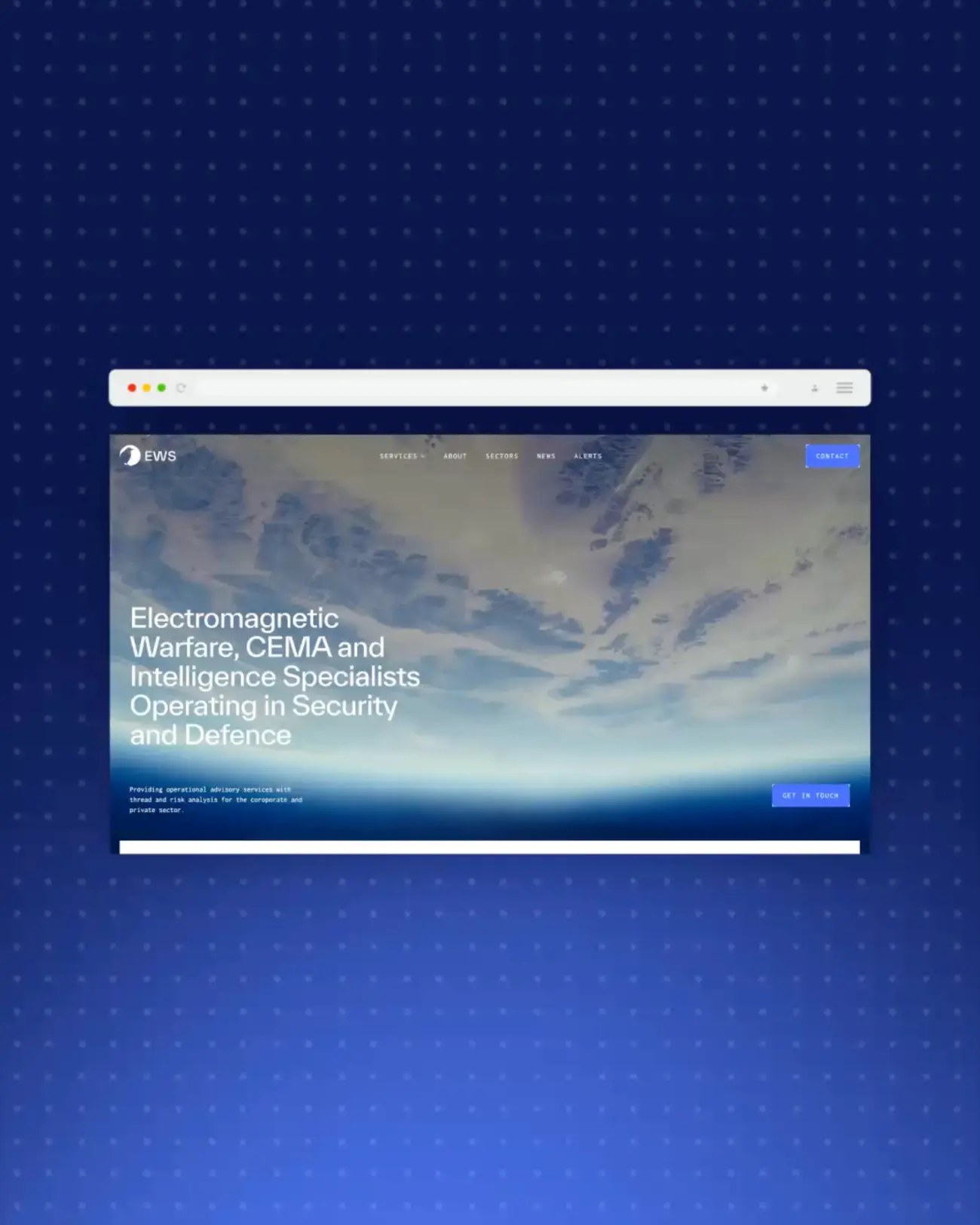
Find Out How To Make Your Website User-Friendly
Your website has roughly five seconds to make an impression before a visitor decides whether to stay or scroll away.
That might sound dramatic, but it reflects how people actually behave online. Attention spans are short, options are endless, and users have become remarkably good at spotting when a website isn't working for them. A slow-loading page, a confusing menu, or a layout that doesn't quite work on mobile is all it takes for someone to leave and find a competitor who makes life easier.
The encouraging thing is that creating a user-friendly website doesn't require a massive budget or a complete rebuild from scratch. Often, the biggest improvements come from getting the fundamentals right: clear structure, fast performance, relevant content, and a design that puts the visitor first.
At Wizard Pi, we build and design websites that do exactly that. So here's what genuinely makes the difference.
What Does "User-Friendly" Actually Mean?
When people talk about user-friendly websites, the conversation often stops at navigation. But genuine usability runs much deeper than that. A truly user-friendly website is:
Useful - it gives visitors the information they need to make a confident decision.
Usable - it works intuitively, without requiring effort or guesswork.
Findable - content is structured so both users and search engines can locate it quickly.
Accessible - it works for everyone, including those using assistive technologies.
Credible - it builds trust through professional design, honest content and social proof.
Fast - it loads quickly, on every device.
Mobile-ready - it adapts seamlessly to smartphones and tablets.
These are sometimes described as the seven pillars of UX design, and they form a useful benchmark for any honest website audit.
Why UX Website Design Matters for Your Business
A poor user experience doesn't just frustrate visitors. It has direct commercial consequences.
High bounce rates tell Google that people aren't finding your content useful, which can drag your search rankings down over time. Slow loading times cost you conversions, with research consistently showing that users abandon pages that take more than a few seconds to load. Unclear navigation means even your most motivated visitors may leave without completing the action you wanted them to take.
On the other hand, investing in better UX website design pays dividends across every area of your digital marketing. When visitors find what they need easily, and the experience feels smooth, they stay longer, explore more pages, and are far more likely to convert. Returning visitors are also cheaper to acquire than new ones and tend to be more valuable over time.
In short, creating user-friendly websites isn't a design preference. It's a business priority.
1. Make Your First Impression Count
Everything a visitor sees before they scroll, the area known as "above the fold", is the most valuable real estate on your website. It needs to do a lot of work very quickly.
Within those first few seconds, your homepage should make three things immediately obvious: who you are, what you do, and what the visitor should do next. Vague straplines and decorative copy won't cut it here. Lead with a clear, direct statement of your value, backed up by a strong visual and a visible call to action.
If a visitor has to scroll or hunt for basic information about your business, you've already lost them. The goal is to remove all friction from that very first moment of contact.
2. Simplify Your Navigation Structure
Navigation is where user experience is won or lost more consistently than almost anywhere else on a website. If people can't find what they're looking for quickly, they leave. It's rarely a conscious decision; it just happens.
Good website navigation follows a clear, logical hierarchy. Start broad and narrow down: homepage to services to a specific service, for example. Limit your top-level menu to around five to seven items, using short, descriptive labels that leave no room for ambiguity. Clever-but-cryptic headings might feel creative, but they create friction.
A few practical principles worth following:
Keep menus consistent across every page so visitors always know where they are. Use drop-down menus for subcategories, but don't layer them so deeply that they become a maze. Add breadcrumb navigation on content-heavy sites to help users track their location and move backwards easily. Consider a site search function if you have a significant number of pages or a regularly updated blog.
Navigation that feels effortless builds confidence and keeps people exploring. Navigation that requires effort sends them elsewhere.
At Wizard Pi, user-friendly navigation is one of the core principles we design around, because we know that even the most visually impressive site will underperform if visitors can't move through it naturally.
3. Design for Mobile First, Not as an Afterthought
More than 60% of web traffic now comes from mobile devices. If your website was built for desktop and adapted for mobile as a secondary consideration, the majority of your visitors are likely experiencing a watered-down version of it.
Mobile-first design means thinking about the small-screen experience before the large one. That includes touch-friendly buttons large enough to tap accurately, font sizes that are readable without zooming, content that reflows naturally on narrower screens, and menus that work with a thumb rather than a cursor.
There are SEO implications here, too. Google now indexes the mobile version of your website rather than the desktop version when determining rankings. A poor mobile experience doesn't just cost you visitors, it can cost you visibility in search results.
Test your site across a range of devices and screen sizes regularly. What looks clean and considered on a laptop can be a completely different experience on a phone, and often not a good one.
Our web design service at Wizard Pi builds every website to be fully responsive from the ground up, ensuring your visitors get a great experience, however they find you.
4. Speed Up Your Website
Page speed is one of the most consistently underestimated aspects of creating a user-friendly website, and one of the highest-impact improvements you can make.
A site that loads quickly feels professional and inspires trust. A slow site feels broken, regardless of how polished the design might otherwise be. Google has confirmed site speed as a ranking factor for both desktop and mobile search, so the consequences extend beyond user experience alone.
To improve loading times, start with the most common culprits:
Compress and correctly size your images before uploading. Oversized image files are one of the leading causes of slow page loads. Enable browser caching so returning visitors benefit from faster load times. Minimise unnecessary plugins, scripts and third-party tools that add weight to your pages without adding value. Choose a reliable hosting provider with strong server response times. Consider a content delivery network (CDN) if you're serving a broad geographic audience.
Tools like Google PageSpeed Insights and Lighthouse are free, detailed, and will give you a prioritised list of exactly what's slowing your site down and how to fix it.
5. Structure Your Pages for Scanning, Not Just Reading
Here's something worth accepting about how people consume content online: they don't read it, at least not in the way you might hope. Most users scan pages, picking up on headings, bold text, short paragraphs and visual cues to locate what's relevant to them before deciding whether to read further.
Your page layout needs to reflect this behaviour rather than work against it. A few principles that make a consistent difference:
Place the most important information at the top of each page, not buried halfway down. Use a clear heading hierarchy (H1, H2, H3 and so on) to break content into labelled sections that guide users through the page. Keep paragraphs short. Four or five sentences are usually sufficient. Use white space generously; cramped, dense pages feel overwhelming even when the content itself is good. Use bullet points and numbered lists wherever content can be broken down into steps or distinct items.
A well-structured, easy-to-scan page also performs better in search. Clear headings help Google understand your content, and well-organised information is more likely to appear in featured snippets and People Also Ask results.
6. Answer the Questions Your Visitors Are Actually Asking
One of the most common UX pitfalls is producing content that describes a business without addressing the needs of the person reading it. If someone lands on your services page wanting to understand pricing, process or timelines, and they find nothing but vague marketing copy, they'll look for a business that gives them more to work with.
Think about the questions your ideal customer is likely to have at each stage of their journey. What do they need to know before they enquire? What hesitations might they have? What does "good" look like to them? Answer those questions clearly and directly within your content.
An FAQ section is particularly valuable here. It addresses common queries in a scannable format, allows you to incorporate supporting keywords naturally, and positions your pages well for featured snippets in Google search results. It also signals to visitors that you understand their concerns, which builds confidence in your business.
A well-maintained blog that covers topics relevant to your audience adds further value. It gives visitors a reason to return, demonstrates expertise over time, and supports your broader SEO strategy. Consistent, useful content is one of the most sustainable ways to build organic visibility.
7. Use CTAs That Are Clear, Visible and Purposeful
A call to action (CTA) is the prompt that converts a browsing visitor into a lead or customer. Without well-placed, well-worded CTAs, even genuinely interested visitors may leave without doing anything, not because they weren't ready, but because the next step wasn't obvious enough.
Specific, action-led CTAs consistently outperform vague ones. "Get a Free Quote," "Book a Consultation", and "Start Your Project" tell the visitor exactly what will happen when they act. "Click Here" or "Find Out More" tells them almost nothing.
For placement, above the fold is typically the highest-priority position. You should also include CTAs at natural decision points within your content — particularly at the end of service pages and blog posts, where a visitor has just taken in information and may be ready to act on it.
Make sure CTAs stand out visually without feeling out of place. A contrasting button colour, legible typography and sufficient surrounding white space are usually all you need. Avoid overloading a single page with too many competing prompts, too many options often lead to no action at all.
8. Build Trust Through Social Proof and Contact Transparency
A visitor who doesn't trust your website won't convert, regardless of how well-designed or well-written it is. Trust has to be earned quickly, and design plays a significant role in how credible a site feels.
Customer testimonials and reviews are one of the most effective trust signals available. They show that real people have had positive experiences and are willing to say so publicly. Case studies and project examples go a step further by demonstrating the kind of results you actually deliver. Accreditations, professional memberships and industry affiliations add further credibility by signalling that your business is accountable to recognised standards.
Your contact information matters more than many businesses realise. A clearly visible phone number, email address and, where relevant, a physical address remove the anonymity that makes some visitors cautious. A dedicated contact page that's easy to find from anywhere on the site is a basic expectation that's still surprisingly often overlooked.
The more transparent your business appears online, the more comfortable visitors feel about taking the next step.
9. Keep Your Content Fresh and Your Website Updated
A website that hasn't been touched in a year or more sends a quiet but clear signal to visitors and search engines alike. Outdated service information, stale news sections, old copyright dates in the footer, and broken links all erode the credibility you've worked to build.
Keeping your website current doesn't mean overhauling it every few months. Consistent, incremental updates make a significant cumulative difference:
Review and refresh key service pages whenever your offering changes. Publish new blog content regularly to demonstrate ongoing expertise and give Google fresh material to index. Update imagery and any time-sensitive copy at least twice a year. Check for broken links and redirect or remove pages that are no longer relevant.
Returning visitors notice when a website evolves. It signals that a business is active, engaged and worth coming back to.
10. Make Accessibility a Priority, Not an Optional Extra
Web accessibility is frequently treated as something to consider once everything else is done. In practice, it should be built in from the start.
Approximately one in four people in the UK has a disability of some kind, with many relying on assistive technologies such as screen readers to browse the web. If your website doesn't account for this, you're excluding a substantial portion of your potential audience and potentially falling short of obligations under the Equality Act 2010.
Accessible design is also simply better design. Clear heading structures, sufficient colour contrast between text and background, descriptive alt text on images, and logical keyboard navigation all improve the experience for every visitor, not just those with specific access needs. These aren't cosmetic refinements. They're fundamental to what it means to build a genuinely user-friendly website.
11. Measure, Test and Keep Improving
A user-friendly website is not a one-time project. It's an ongoing process of monitoring, refining and responding to how real users behave.
Google Analytics tells you which pages have high bounce rates, how long visitors are staying, and where they're dropping off in their journey. Google Search Console surfaces technical issues and gives you a clear view of your search performance. Tools like Hotjar allow you to watch heat maps and session recordings that show exactly how users are moving through your layout, where they're clicking, where they're hesitating, and where they're leaving.
Use this data to identify friction points and prioritise improvements with confidence. A/B testing is particularly useful for optimising CTAs, headlines and page structures, allowing you to make evidence-based decisions rather than design-by-instinct ones.
Businesses that build a culture of continuous improvement around their website consistently outperform those that treat launch day as the finish line.
Quick Checklist: Is Your Website Doing Its Job?
Use these questions to get an honest snapshot of where your site currently stands:
Does your homepage make it immediately clear who you are, what you do and who you're for? Is your navigation logical, consistent and easy to use on mobile? Do your pages load quickly on both desktop and mobile? Is your content structured for scanning, with clear headings and short paragraphs? Are you answering the questions your audience is genuinely asking? Are your CTAs specific, visible and action-led? Does your site build trust through testimonials, reviews and accessible contact information? Have you tested your site across different devices and browsers recently? Are you regularly reviewing performance data and using it to make informed changes?
If the answer to any of those is no, there's a meaningful opportunity in front of you.
Make Sure Your Website is User-Friendly - Contact Wizard Pi
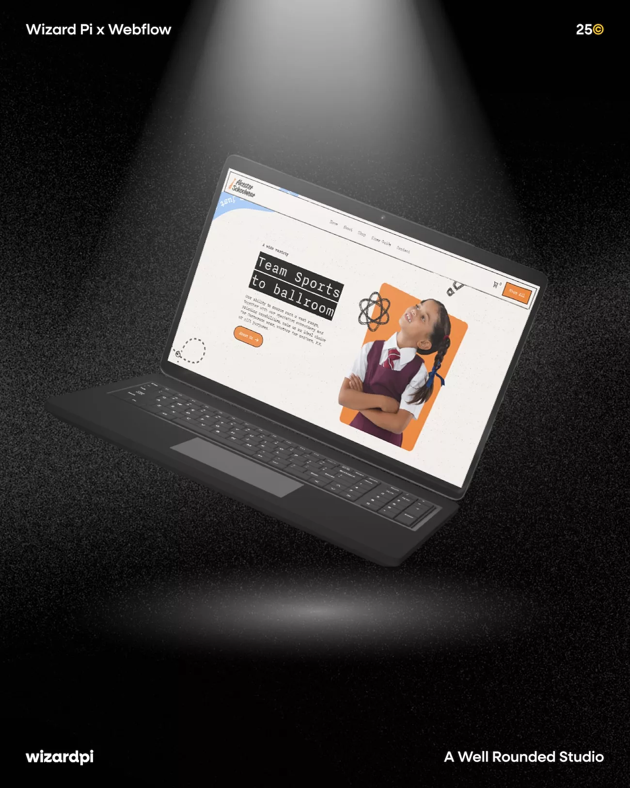
At Wizard Pi, we build user-friendly websites that go beyond looking good. Every site we design is built around clear user experience principles: intuitive navigation, responsive layouts, clean structure, and a bespoke design that reflects your brand rather than a generic template. Our web design services are built on Webflow, giving us the flexibility to create bespoke, high-performing sites tailored to your specific goals, whether that's a full business website, a landing page, an e-commerce solution, or a compact microsite that makes a big impact.
We keep the process collaborative and jargon-free. You'll see wireframes and mock-ups before a single line of code is written, and we won't sign off until the site feels exactly right.
If your current website isn't delivering the results you need, let's change that. Get in touch with the Wizard Pi team to start the conversation.