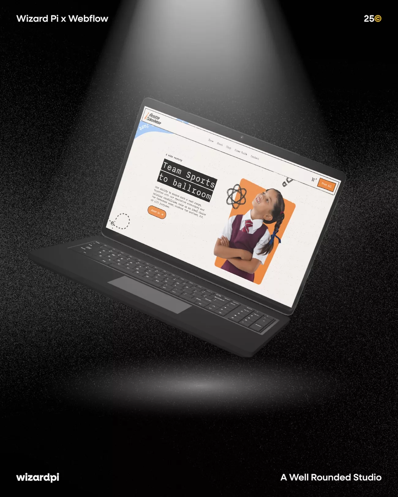
How We Built the EW Solutions Website - And Why Two "Simple" Design Features Took Longer Than You'd Think
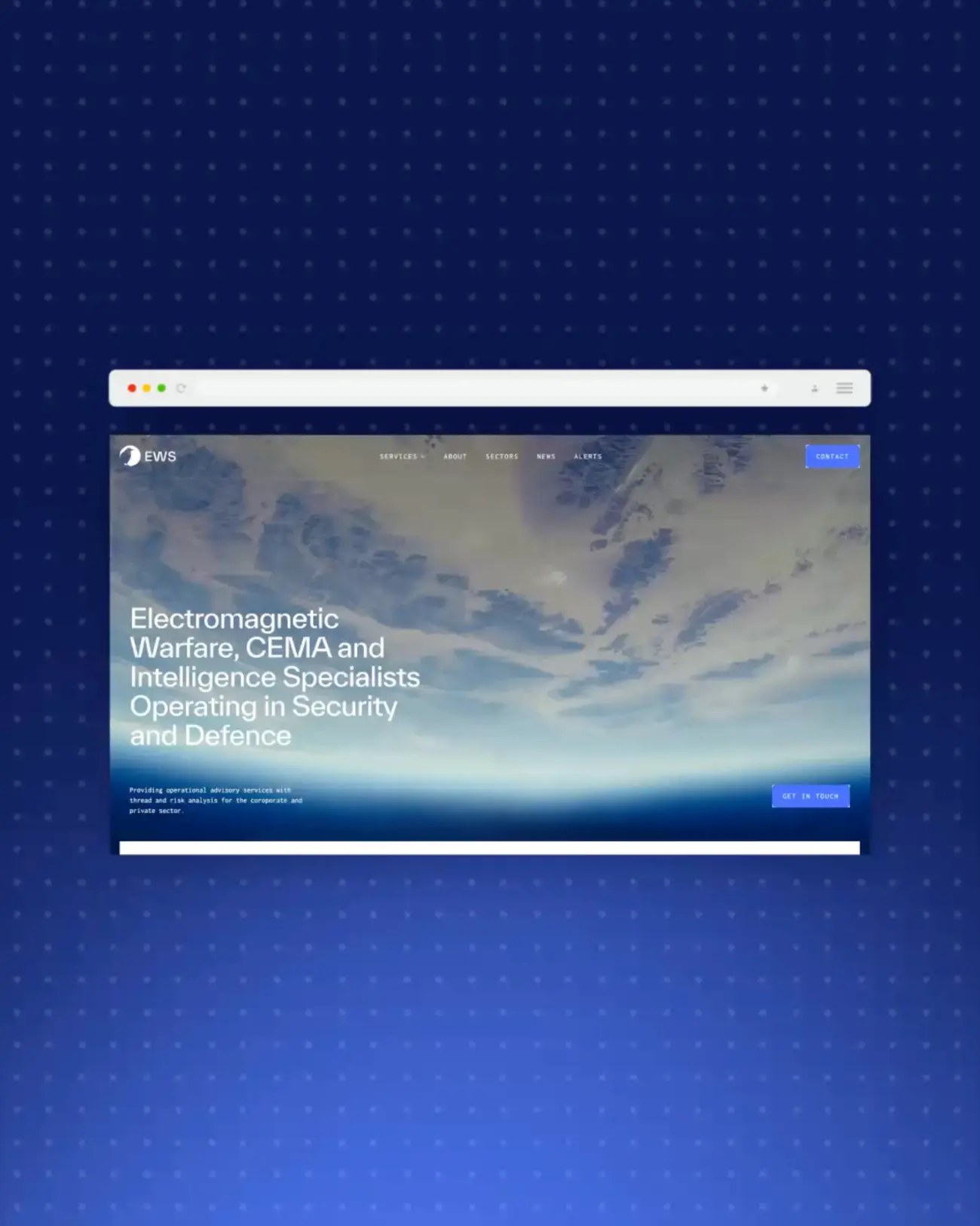
EW Solutions are electronic warfare and CEMA specialists. Consultancy, intelligence, training, engineering - serious work for serious organisations operating at the highest levels of defence and security globally.
So when it came to the website, "standard corporate template" was never going to cut it.
The Brief: Building a Website for the Cyber and Electronic Warfare Sector
Operating within the cyber sector, we wanted the visuals to fully embrace a digital, futuristic, technology-driven aesthetic - and that thinking runs through everything. The typography, the colour palette, the imagery, the background patterns. Every element considered with that brief in mind, right down to details most visitors will never consciously register.
Which is, honestly, exactly the point.
Today we're focusing on two specific features that help bring that theme to life: the notches and the scramble text effects. Particularly noticeable in the site's buttons, these techniques actually run throughout the whole site - but the story of how we got there is worth telling.
The Notches: Small Detail, Big Challenge
Notches are the small angular cutaways you'll notice on the corners and edges of buttons and other interface elements. They help create a technical, futuristic feel and are used throughout the site in a variety of ways.
What seemed like a simple design feature turned out to be surprisingly challenging to implement. We explored several approaches before landing on the final solution.
Div Blocks
Our first attempt used overlapping div blocks to build each notch. While it worked, it quickly became difficult to scale, customise, and maintain across different elements. It also added a lot of unnecessary complexity within the Webflow Designer.
SVGs
Next, we experimented with SVG paths. Although cleaner in theory, they proved difficult to scale and adapt consistently across the site, so we moved on from this approach fairly quickly.
The Solution - Custom HTML and CSS
We ultimately settled on a custom HTML and CSS solution. By creating a reusable embed, we could add notches to any element while still controlling styling through Webflow. The result was a much cleaner, more flexible, and scalable implementation that was far easier to maintain.

The Scramble Text: Making a Website Feel Like It's Processing Data
To further reinforce the site's technological theme, we incorporated GSAP's ScrambleText library. Used throughout the site, it creates the impression of digital information being processed or decoded, adding depth, personality, and a distinctly cyber feel.
The effect is triggered in two main ways: on hover and when elements scroll into view. Check it out.
The CMS Challenge
While implementing ScrambleText on buttons is relatively straightforward, CMS-driven content required a more considered approach. On elements such as news cards, the scramble effect is applied to the text while the interaction trigger sits on the larger parent container. This allows users to click anywhere within the card, creating a more intuitive experience without sacrificing the visual effect.
Knowing When to Use It
We also had to consider content length. ScrambleText works best with shorter copy, as longer sentences can wrap during the animation and cause layout shifts. Rather than apply heavy fixes site-wide, we made deliberate choices about where the effect would land hardest and used it there. Restraint is its own kind of craft.
Why the Details Nobody Notices Matter Most
You're probably thinking - why spend so much time on something like this?
For us at Wizard Pi, it's about pushing the boundaries of what's possible on the web. We're constantly exploring new ways to elevate design - whether that's through the user interface, the overall experience, or interactions like the scramble text effect. Our goal is always to create websites that reflect our clients' brands and objectives, but also challenge the conventions of traditional web design. We don't just want sites to look good. We want them to feel unique, memorable, and crafted with purpose.
Because the EW Solutions website needed to feel like EW Solutions. Not like a website. Not like a template with their logo dropped in. Something built specifically for who they are and what they do - down to the details most visitors will never consciously notice.
The notches took considerable thought and refinement. The scramble text required careful implementation across every use case. Neither of those things is visible in the final product - which is precisely how it should be.
The best craft is the kind you don't see. You just feel it.
Take a Look for Yourself
Credit where it's due - Alex, you absolutely nailed this one. The EW Solutions website is a brilliant piece of work and this is just a glimpse of what went into it.
See more of our Webflow web design work